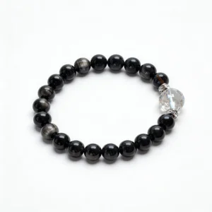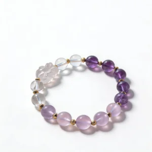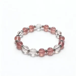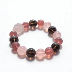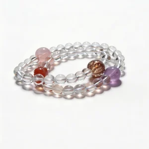


Dark crystal bracelets can look almost identical in a small product thumbnail and noticeably different once light reaches the beads. A glossy black surface, a soft gray flash, a translucent brown edge, or fine linear texture changes how a bracelet reads on the wrist. This guide focuses on those visible differences, plus bead scale, construction, fit, and styling.
Appearance is useful for comparison, but it cannot confirm a material by itself. Product naming, dimensions, close-up photography, and direct disclosure from the seller remain important. Use visual cues to ask better questions, not to make a laboratory-level identification from a screen.
Photograph Dark Beads in Controlled Light
Dark beads need more than one bright hero image. Begin with indirect window light or another broad light source. Turn the bracelet slowly instead of pointing a harsh light straight at it. This makes changes in surface reflection, internal pattern, and edge translucency easier to compare without washing out the bead.
Use the same background for every bracelet in your comparison. White paper reveals the outline and any translucent edges; a medium-gray cloth makes reflective highlights easier to read. Avoid judging color from one heavily edited image because exposure and contrast can turn charcoal, brown, deep green, and black into the same flat tone.
Capture four useful views
- Full circle: shows whether color and bead size vary across the bracelet.
- Three-bead close-up: shows surface polish, pits, grooves, clouding, or reflective bands.
- Edge-lit view: shows whether light passes through thinner parts of a bead.
- On-wrist view: shows scale and contrast against skin, sleeves, and nearby accessories.
Keep the camera distance similar when comparing two pieces. Enlarging one image more than another can make bead size, texture, and finish appear misleadingly different.
Read Sheen, Transparency, and Surface Texture Separately
Do not compress every observation into “shiny” or “matte.” Separate the cues so the comparison stays useful. Sheen describes how a highlight moves across the surface. Transparency describes whether light enters the bead. Texture covers visible grain, grooves, pits, banding, and polish.
- Moving reflection: rotate the bead and watch whether a pale band or patch changes position.
- Translucent edge: check the thinnest visible edge rather than the darkest center.
- Consistent polish: compare several beads for similar gloss and surface condition.
- Natural-looking variation: note differences across the strand without assuming that variation alone proves identity.
If a listing names a specific material or optical effect, compare that description with all available views. Ask for an ordinary-light photo when the only images use strong directional lighting. A clear answer about what is shown is more useful than a dramatic claim.
Use Bead Scale to Shape the Look
Dark color gives a bracelet visual weight, and bead diameter changes that effect. Smaller beads create a finer line around the wrist. Larger beads show more surface detail and occupy more space beside a watch or second bracelet. Use listed millimeter measurements instead of estimating from a cropped image.
For a single bracelet, repeated bead size keeps attention on texture and sheen. For a stack, vary only one major element at a time. You might pair larger dark beads with a slimmer light-toned strand, or keep the diameter consistent while changing surface finish. This makes the contrast intentional rather than crowded.
Measure fit for the actual bead size. A bracelet made from larger beads has a different inner opening from a slim-bead piece with the same outer circumference. Review the bracelet size guide and compare the seller’s stated fit information before checkout.
Inspect Stringing, Spacers, and Focal Details
A dark bracelet makes small construction details easy to notice. Look between beads for visible cord, uneven gaps, or spacers that sit at an angle. Check whether a focal bead or charm appears centered and whether neighboring beads leave it enough room to move without pinching the connection.
Metal spacers can sharpen the contrast, but their finish should be evaluated separately from the stone. Review close-ups for scratches, color consistency, and visible openings at connecting rings. Do not infer metal composition from color alone; rely on the product description when that detail affects your decision.
For elastic styles, roll the bracelet over the hand one piece at a time rather than pulling one section far away from the wrist. After wear, check the cord area and the spaces around heavier focal elements for visible changes. These are practical condition checks, not claims about how long a bracelet will last.
Build Wardrobe Contrast With Fewer Elements
Dark beads work as a strong outline, so the surrounding colors do not need to be complicated. Against a white shirt, pale knit, or denim cuff, the bracelet becomes a clear graphic detail. With black clothing, reflective finish, translucent edges, metal spacers, or a contrasting companion bracelet keep the shape visible.
Choose one repeat across the outfit: metal color, bead diameter, or one lighter accent. A watch with silver-color hardware can connect to a small spacer. A warm brown or gray bead can bridge black stone and earth-tone clothing. The point is visual continuity, not a promised effect or prescribed meaning.
Before stacking, place the bracelets on a flat surface in wearing order. This reveals whether one focal piece is hidden and whether several large beads compete for the same space. Then try the group on and remove any piece that limits movement or makes the arrangement feel unnecessarily dense.
Use a Listing Evidence Checklist
A useful dark-stone listing should let you compare the product without guessing. Look for the following details:
- a specific material name rather than only a color label;
- bead diameter and bracelet sizing information;
- more than one photo angle, including an ordinary-light view;
- a clear description of spacers, charms, or other findings;
- care guidance and any disclosed material enhancements;
- return information available before purchase.
Missing information is a reason to ask a direct question. It is not evidence for or against authenticity on its own. Keep screenshots and product details together when comparing several bracelets so lighting, scale, and seller descriptions do not blur into one another.
Store the Finish You Chose
After wear, wipe the bracelet gently with a clean, soft cloth if its supplied care instructions allow. Keep it separate from keys, metal chains, and sharp-edged accessories. A soft pouch or divided jewelry tray reduces contact and makes it easier to inspect reflective surfaces before the next wear.
Follow care directions for the named material and hardware rather than applying one cleaning method to every dark stone. If the seller has not provided enough detail, ask before using water, cleaners, prolonged sunlight, or other methods that could affect a surface or finish.
Choose by Observable Detail
The most useful dark crystal bracelet comparison is specific: how the light moves, where the bead becomes translucent, how consistent the polish looks, what the measurements say, and how the construction sits on the wrist. Those observations create a more dependable decision than broad outcome language.
Explore crystal bracelets, compare the wider QZZEN shop, or use QZZEN Create to arrange bead colors and scale around your preferred dark-stone focal point.