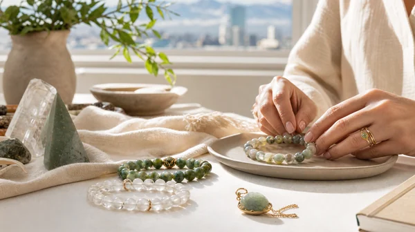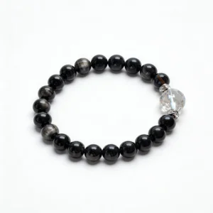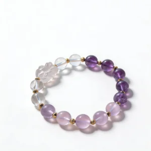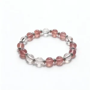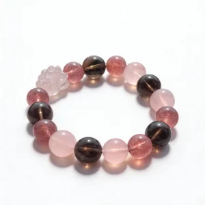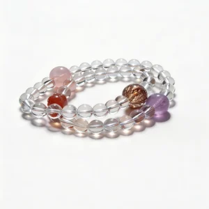


Color is one of the fastest ways to compare crystal bracelets, but a useful palette needs more than a favorite shade. Hue, lightness, saturation, translucency, bead size, and metal details all change how a bracelet looks on the wrist. This guide turns those visible elements into a practical styling system without assigning guaranteed effects to any color.
Natural-stone appearance can vary across beads and across lighting conditions. A photo can help you compare a palette, but it cannot confirm material identity by itself. Use seller-provided material names, measurements, ordinary-light images, and disclosed material enhancements alongside your visual review.
Set a Daylight Color Baseline
Begin in indirect daylight near a window. Place the bracelet on plain white paper and then on medium-gray fabric. The white background makes darker edges and inclusions easier to see, while gray reduces the visual impact of a bright background. Turn the bracelet through a full circle so one reflective bead does not define your impression of the entire strand.
Compare bracelets under the same light, at the same time, and against the same background. Warm indoor bulbs can shift pale pink toward peach and make some purples look redder. Cool light can emphasize blue and gray. Neither view is automatically wrong, but mixing them in one comparison makes a color decision less reliable.
Record three reference images
- Flat lay: photograph the full bracelet from directly above.
- Wrist view: show the beads beside a sleeve or watch you wear often.
- Close-up: include several adjacent beads to capture variation, not one selected bead.
Keep automatic filters turned off when possible. If you are comparing product pages, remember that camera settings, editing, and screen calibration can change color. Look for consistency across several images instead of expecting an exact screen-to-object match.
Separate Hue, Value, and Saturation
Describe each bracelet using three simple properties. Hue is the color family, such as green, violet, pink, brown, or black. Value is how light or dark the bracelet appears. Saturation is how vivid or muted the color looks. Separating these properties gives you a clearer comparison than a broad label such as “purple bracelet.”
- Similar hue, different value: pale lavender and deep violet can create depth while remaining visually related.
- Similar value, different hue: two medium-tone bracelets can sit together without one dominating the stack.
- Vivid plus muted: a low-saturation strand can give a brighter focal bracelet more space.
- Light plus dark: strong value contrast makes bead outlines and spacing more visible.
These are composition choices, not rules about what a color represents. The most useful palette is one you can recognize in ordinary light and combine with clothing you already own.
Notice Warm and Cool Color Tendencies
Two bracelets in the same color family may lean in different directions. A pink can appear peachier or bluer; a green can lean yellow, blue, or gray; a violet can shift toward red or indigo. Place the bracelets side by side rather than relying on memory. Their relative tendencies usually become clearer when they share a background.
Metal findings also influence the palette. Yellow-color spacers can emphasize warm notes, while white-color metal can repeat cooler highlights. Do not infer metal composition from appearance. If the material matters, rely on the listing details and ask for clarification when those details are absent.
Skin, sleeves, watch bands, and bag hardware all become part of the final color context. Use an on-wrist photo to decide whether you want the bracelet to blend with those elements or stand apart from them.
Use Three Reliable Palette Structures
You do not need a large collection to build a considered combination. Start with one of three structures and limit the number of changing variables.
Monochrome range
Choose one hue family in two or three values. A pale, medium, and deep version creates a clear progression. Keep bead size or metal finish consistent so the value change remains the main feature.
Neighboring colors
Combine colors that sit close together visually, such as blue-green with green or pink with violet. Use one quieter strand between two more varied pieces if the stack feels busy.
Light-dark contrast
Pair a pale bracelet with a charcoal, brown, or black strand. This approach makes each silhouette easy to read and works well when both pieces have visible natural variation. Repeat one small detail, such as bead diameter or spacer color, to connect the pair.
Let Bead Size Control Color Weight
A color occupies more visual space when the beads are larger. An 8 mm strand and a 12 mm strand may share a hue but play different roles in a stack. Larger beads can act as the focal line; smaller beads can add a secondary color without taking over the arrangement.
Use listed measurements rather than estimating from enlarged product photos. Also review wrist fit because bead diameter affects the inner opening and the space a bracelet takes beside other jewelry. The bracelet size guide provides a practical starting point for comparing fit.
When mixing sizes, place the largest strand first and add one bracelet at a time. Check whether the beads press against a watch, hide a focal detail, or restrict movement. Removing one color is often more effective than adding another spacer bracelet to solve a crowded composition.
Build From an Existing Wardrobe
Select three clothing colors you wear frequently and photograph them together in daylight. They form a small wardrobe reference. A bracelet can repeat one of those colors, bridge two of them, or provide a deliberate contrast. This keeps the purchase connected to actual outfits instead of an isolated product image.
For neutral wardrobes, decide whether the bracelet should be the strongest color or remain tonal. Cream, gray, navy, denim, and black all provide different backgrounds. For colorful wardrobes, repeating one existing hue usually creates more continuity than introducing several unrelated accents at once.
Include metal hardware in the reference. A watch case, ring, zipper, or bag clasp can make a small spacer detail feel intentional across the full outfit.
Check the Listing Before You Choose by Color
A useful listing should provide more than a polished color image. Look for:
- a specific material name and any disclosed enhancements;
- bead diameter and bracelet sizing details;
- multiple images, including a full strand and close-up;
- ordinary-light color alongside any studio image;
- a description of spacers, charms, and other findings;
- care and return information available before checkout.
Visible variation can be a helpful comparison point, but it is not proof of authenticity. When two photos conflict or a key detail is missing, ask a direct question rather than filling the gap with an assumption.
Store Palettes So They Stay Easy to Compare
Keep bracelets separated from sharp metal objects and chains that can tangle around the strand. A divided tray lets you arrange pieces by hue or value and compare combinations without stretching them over the hand repeatedly. Follow the supplied care directions for each named material and finding.
Save one ordinary-light reference photo after purchase. It gives you a consistent visual baseline for future wardrobe pairings and makes it easier to notice visible changes in the surface or hardware over time.
Make Color a Design Decision
A wearable crystal bracelet palette starts with observable details: hue, value, saturation, warm or cool tendency, bead diameter, and the colors already in your wardrobe. Compare those elements under consistent light, then choose the simplest structure that makes each bracelet readable.
Browse crystal bracelets, review the wider QZZEN shop, or use QZZEN Create to arrange color and bead scale into a custom bracelet design.